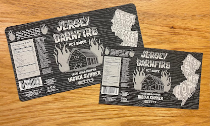
Over the weekend I finished the design for the class critique on Tuesday. I spent a lot of time trying things out and then revisiting them and going back and forth with my decisions. When I first started drawing the flames and the barn, I had used Adobe Fresco but a textured brush. I had drawn everything to the correct size but when I pulled the elements into the Illustrator, everything was blurry. Through some google searching I found out there is a vector brush in Fresco and it worked out great. The barn and flame elements or drawn in Fresco and then dropped into illustrator, and the New Jersey State outline is a Photoshop file that I colored over with a paint bucket.
I also drew the wood texture in Fresco with a vector brush so I could adjust the width of each stroke to look more like wood. The wood texture element was something I originally only had in 1/3 of the design but there was an odd cut on that edge so I decided to just pull it all the way through and really soften it so it isn't distracting.
I'm really happy with how it turned out and while it's such a small label and the shape is pretty easy, I really challenged myself to go in a different direction stylistically and go for something more dark in bold (which I actually really enjoyed). One thing I wish I could add, and I may bring this suggestion up to the class, is adding an overall texture but hopefully I can find the substrate and maybe emulate that with a printing technique.
_______________________________________________________________________
Sadly our class in person was canceled so we did not get to have one last critique before the final project. Thankfully, before I went to print out my final version I did a sample black and white proof to check the size. I had a very stressful moment of me questioning my math skills when I printed out the proof and it was massive...
So I remeasured and decreased the length by 0.25" but still it was huge. So I stopped to think and I realized that my artboard was too small so the computer was blowing the .jpg up to fit an 8.5" x 11" sheet of paper. So I increased the artboard size to 8.5" x 11" and exported as a PDF this time to make sure the white space on the edges wasn't being calculated into the overall size.
I finally got it figured out and at the correct size as a proof. Throughout the whole printing process I made some adjustments to the left side. I increased the weight of the ingredients and made the barcode much bigger. I also increased the font size of their address, social media, and the follow request.
_______________________________________________________________
FORCEpkg (a packaging and design studio I interned at over the summer and still work at on Thursday) was gracious enough to let me print out my project after work. One of the designers helped me prepare my file and walked me through using the uv printer and mimaki cutter to print and cut my label.
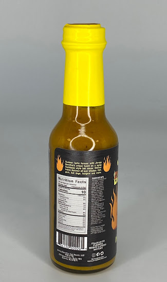
I was able to add a special effect gloss to the wood texture in the background that is visible when moved.
I'm beyond happy with how the final project turned out. One thing I wish I could have done differently was to make the yellow in the design more saturated to match the yellow top better. The softer yellow is a shade of the pure cyan top, but I was worried the bright yellow would be too overpowering, but I think this yellow could have been increased in intensity a little more.


No comments:
Post a Comment