Monday, December 6, 2021

FINAL WEEK

Painting the sheets became a bit of a struggle I wasn't expecting. I started by painting one sheet, doing my best to get the yellow color to match up as well as I could to the yellow on my website. As I painted I noticed the substrate start to curl on the edges. I then started to have difficulty with matching colors for the other sheet and having enough paint so I just decided to have the box be yellow.

When I began using the laser cutter I started to have more challenges primarily because the substrate was painted. First, because the edges were slightly curling up the laser got too close to the substrate and it started to burn. Then when it came to trying to cut out the first set, the power was too high and it burned the substrate even more leaving a smokey effect. 


Thankfully the lab tech helped me position the content on the first round to save extra substrate  so we were able to run the box through 2 more times adjusting the intensity of the laser. I did have to hand cut out the box with an exacto knife because we had to lower the laser intensity as it continued to burn the substrate when it cut. So instead of cutting the dielines out completely for the box it just left a mark that I could follow. 


Deciding to not paint the sheets for the cards was a blessing in disguise because of needing to engrave and cut all the way to the edge of the sheet, with the substrate curling I would have burned all of the cards on the edges. 

I did have to purchase an extra sheet for the final row of cards, but the laser cutter engraved and cut them out perfectly. 

Overall I'm happy with engraving of the project. I really love how the cards came out with the detail and contrast of the illustrations. The game does work too with finding the pairs and it's actually pretty fun to play. 


For my previous laser cut packaging assignment I used double sided take to hold the package together. I had started with the double sided tape again for this box, but because of the paint it wasn't sticking. So I had to carefully peel off the tape and use tiny dots of hot glue to hold the box together.


Some negatives that I found on the last project and that reappeared here. I thought for the last project that the peeling of the top layer of engravings close to a fold was only because I had engravings wrapping fully over fold lines. But even here with icons just being above a fold they still peeled. I tried using a little bit of liquid glue to flatten them back together. 


I also noticed again that the package is a little bowed and curved. Even with creasing and scoring the package is still not as structured as I had hoped. 

On Tuesday morning (bright and early at 8 am) we have our final critique for the project. 

______________________________________________________________________

Tuesday, November 23, 2021

Week Thirteen

The next step is to work on the final file. With my list of items (plus and minus a few) I used my iPad and Adobe Fresco to start the illustrations. I used a vector brush so the designs were resizable and used a similar weight stroke. I made 14 different illustrations and 20 different cards.


I shared my project with my classmates to get their feedback. Thankfully my illustrations are recognizable and people enjoy the concept. I still want to use the laser cutter but I'm not sure if the substrate should be the same card stock I used for the last project or if I should use wood. The wood would be cool but I know the laser cutter tends to burn the project so I think the details will get lost. I'm leaning more towards the card stock.

Next I'm going to work on designing a box for the cards and a rule sheet. I'm going to use the template maker website for a dieline. 

________________________________________________________________

I decided to make more card variations to make the game longer and increase the likely hood of finding a match. I now have 30 playing cards total. 


I used templatemaker.nl to make the box dieline. First, I made the box 4.5" x 4.5" x 1" with a lid hight of 0.5" and added the content, however when I printed the proof I caught a lot of my mistakes. 


First, I had the icons upside down on the sides, so I flipped them around to be facing the correct direction. Next, I decided to change the box size to be 4.25" x 4.25" x 0.875". The 4" x 4" card had too much wiggle room on the sides so I decreased that by 1/4" on each side. 


I changed the height to 0.875" after measuring the overall height of the cards when stacked together. I got a scrap piece of the substrate from the lab and I cut out 31 (30 cards and 1 rule sheet) and stacked them onto of each other to measure the height the final cards would be. I made a little mark on the edge of the paper prototype and placed the little substrate stacked tower next to the paper package. 


Lastly, I noticed in the text that the cross of the lower case f and the dot in the lower case i were connecting when put next to each other. 


I tried adjusting the kerning but for some reason the typeface (Lato) locked those two letters together. So instead I outlined all the text and took an i from another part of the text and placed it in next to the f. 

Below I have my final dieline for my project and the 4" x 4" rule card. 


I figured out the math of how many cards I can fit on a sheet and how many sheets I will need. If I can get the laser cutter to engrave all the way to the edge I can fit 24 cards on an 18" x 24" sheet. Using the line tool, I measured out that the lid is 5.3" x 5.3" and the bottom is 6" x 6". With a second sheet I can fit the dieline and the remaining 7 cards. On Tuesday, when I'm in class, I'm going to meet with the lab tech and purchase two sheets of the substrate to paint so I can engrave on Wednesday. 

Tuesday, November 9, 2021

Week Twelve

For our next and final assignment, we were given two options to pick from: a re-design of a board game (new or existing) or a "you are the gift" multiple component piece. 

My original thought was to do a self promotional package to send to perspective employers showing little things about me, but with that assignment I would using a lot of what I have already created as my visual identity for my website.

So I decided on the board game topic. I began brainstorming styles of games that I currently enjoy, ones I played as a kid and games that were popular at the summer camp I used to work at. As a kid I loved playing with the Where's Waldo books. They were not only fun but each page also was a cool work of art. A few years ago when my family got an Apple TV, I downloaded a Where's Waldo style find it game but called Hidden Folks. Hidden Folks is a hand-drawn, interactive, miniature searching game all in black and white. The game is honestly a bit overwhelming at first, but as you zoom in and interact with the little figures it is super fun.

For my assignment I decided on a Hidden Folk style card game with a Spot-It approach (another game I played as a kid). I will have 30 cards all with different layouts of objects and the idea will be to place out four cards on the table and when players find a match they can take the two cards and put out two more. 


I still want to connect the project back to me in some way. So for the objects on the cards I am going to use things that I like and describe me drawn similarly to how my masthead is on my portfolio website


________________________________________________________

I missed class on Tuesday as I went to the AIGA Career Festival. However, I started making a list of items I want to include in my illustrations. 

  • goat
  • lavender
  • tree
  • leaf
  • bike
  • city 
  • sun
  • shoes
  • beach
  • avocado
  • mountains
  • stars
  • coffee
  • plant
  • books
  • computer
  • cookie
  • heart
  • dino nugget
  • paw
  • airplane
  • fish
  • picture frame
  • koala
  • california 
  • moon
  • backpack
  • goat
  • pancakes
  • cursor
  • paint brush 

Tuesday, November 2, 2021

Week Eleven

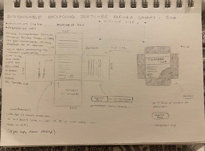
The laser cutting was a success! The device was able to read my stroke marks and engrave and cut the design. I brought back my flat cut dielines to my room to work on constructing the final pieces.


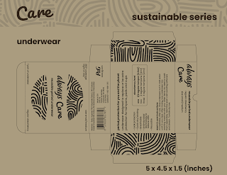
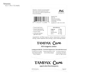
I had some trouble with building the final pieces but I finally got them together. Using double sided tape, a binder clip to score, and a metal edge ruler I was able to fold the packages together. I purchased some new, unused items (PINK period underwear, Diva Cup menstrual cup, and the o.b applicator free tampons) to place in the boxes the packaging to give them more realistic weight. 

I'm going to take a nicer staged photo of the final design but here are the final pieces constructed: 


One disappointing thing I noticed was how some areas of the engraving that were close to folds began to lift up. Because the paper stock is comprised of layers, when folded it began to separate. If I choose to laser engrave again I will have to consider that negative aspect and keep the art away from the folds.


___________________________________________________________________

Today we presented our finished eco-series projects to the class. We set up our pieces on our desk and in small groups worked our way around the room writing feedback. 

I received a lot of positive comments on my pieces. I did have a few notes about the durability of the products with shipping especially for the menstrual cup. While I really enjoy the packaging concept with the exploding box I agree that from a manufacturing standpoint the strict of the package will have to be adjusted. Here is a photo of the feedback:


The last part of this project is creating a presentation pitch we, hypothetically, would show to the brand we designed this series for in hopes they would implement our collection. Using InDesign, I worked on a layout using the typography and colors from the completed packaged products. I completed almost all of the presentation, but I still need to stage and take some nice photos of the completed products.

__________________________________________________________

For my presentation pitch and my website I wanted to make sure I have nice photos of my three packages. I used a light box at and tripod to set up the photos. I took a bunch at different angles and with the products opened and closed.


I made a page on my website showing some progress and the explanation of the project and I finished the presentation. 


Tuesday, October 26, 2021

Week Ten

I presented my paper prototype to the class for feedback and decided to move the top down to the front side so on a shelf the tampons would't be sitting sideways.

While in class, I went up to the fab lab to get a scrap of the the single ply cardboard which I think is actually just a heavy weight brown cardstock... I wanted to see how the substrate would fold and how much clearance I should leave for the text. I first folded without scoring and got some wrinkles and cracks so the next fold I scored with the top of my lack-of-eraser lead pencil and it looked much better. I make a little sleeve like my tampon box would be. 


The rest of the day and night I spent working on the final art. I kept with the 9pt font being the minimum size and adjusted kerning/leading for the legal copy so it appears smaller. I found a barcode generator online and used the products I was referencing for content for the barcode number. I also adjusted the dielien stroke to be the 0.001 so the laser cutter cuts not engraves that part. My next step is to add the line texture and mask off the parts I want to show. I will then send it to Professor Mata for the final step of feedback. 


_________________________________________________________________
 
After working out the text layout I worked on the line texture. I kept the same weight as the Care text to help tie that in better as the font I chose is a little heavy in visual weight compared to everything else. It took lots of clipping mask and selection tool deletes but I finally worked out a layout. I'm going email it to Professor Mata now for some more feedback and print out dielines tomorrow to double check the specs before I go to do the final print. 


_________________________________________________________________


I heard back from Professor Mata about some suggestions on what to fix. She shared with me the following:

Your designs look very professional. I can’t wait to see them engraved. If you have problems or issues with the engraving don’t freak out! I would rather see you try and fail than not try at all.  

Just a few things to look at…

  1. Make the barcode smaller on the pads. 
  2. For all make the Ingredients italic. (unless it won’t engrave)
  3. Menstrual cup: on the Made by Women side, look at the edge tension of the body copy. 


Professor Mata


I made two of the adjustments she suggested but I did not italize the ingredient as I'm not sure how that would effect the engraving. I would rather play it safer especially with trying something so new.

I printed out my dielines with my work to check more of the edge tension and orientation. I bumped a few more text items in on the cup package and I flipped around the bullet point list panel on the tampons as it was was upside down. I also realized I missed adding the line art to the sides of the underwear box, so I fixed that as well. 


I've been in communication with the fabrication lab tech, Zach, to get more information on how engraving works. One point he shared with me is that I need to make sure that no lines are overlapping and that everything is ungrouped. Because of my clipping masks I had many groups with the lines and even the barcodes. 

I began brainstorming of how I can cookie-cutter cut out the shapes. I started with releasing the masks and placing the shapes ontop to divide and then delete everything that was cut and on the outside of the shape. Then my friend and classmate Hannah O'Steen shared with me a tutorial she found using the clip tool in pathfinder and I was able to quickly delete everything on the outside of the clipping mask and then ungroup the lines.

Tuesday, October 19, 2021

Week Nine

In class we shared our revised/final sketches in small groups and then to Professor Mata. The main concern my group shared was that pattern maybe too busy. I shared with them my concept of engraving the design and how it will appear more subtle. With Professor Mata I spoke to her about having both French and English on the packaging. She told me to just focus on the English for now especially because I am trying out the engraving for the first time and I want to make sure the text is large enough to read.

Next we went into Adobe Dimensions and began to play around with how to create 3D renderings. For this assignment, we are to submit a 3D mockup of the design, unless the package is unique in shape and we can't find a template, then we can print the project out. 

Because I'm wanting to add a special effect with the engraving and my packaging is more unique, I'm going to print my set out and make a physical version of them. 

I used the art from my last project and found a free download of a sauce bottle on Adobe Stock and made a rendering of the design.


________________________________________________________________

The next step of my project is to go digital. I went back to 
templatemaker and began working on the measurements of my dielines. I measured the box of the o.b. organic tampons for my tampon box and a new menstrual cup for the width and height of the cup box. I also folded up a pair of new period underwear to get the length, width, and height of that box as well. I downloaded the dielines as svgs and brought them into Illustrator. 


Before I started the final art I wanted to make sure my dielines would be the correct size and fold correctly. Thankfully I did check because my cup box was too big so I brought it in an inch. Because the laser engraver has a minimum pt size of 9 for text, I used my tampon match box dieline to draw on and fold to get a rough estimate of it visually. I put the o.b. tampons in the box for now but because they have a logo on them I'll have to try and photoshop it out or remove the plastic. 


Monday, October 18, 2021

Week Eight

After receiving feedback from Professor Mata I began my final sketches of the layouts. Here is the feedback she let me: 

You did a good job with your sketches and concepts. The ones that seem to be working the best are the Nature concepts C and D. The Typography concept could work depending on the words you would use. Perhaps you could use empowering words. If you decide to go with textures be careful they don't look like pimples. I am excited to see what you can do with the laser cutter. Do some tests before you commit and remember not too many details in the design. Pick the concept you want to do and do more refined drawings or experiment with the laser cutter to see which one would work best.   

The nature concepts she favored is the the water element and the poppy flowers. I decoded to go with the water, flowing design because while period products are targeted for women, female products don't have to be overly feminine.


With the laser cutter test/example sheet there is an example of using lines and creating a texture. For my next set of sketches I really focused on that pattern and how I can position the engravings on the package elements as well as set a plan for a text layout. I used the tampon packaging and the current Always nighttime underwear as well as Unders reusable underwear and collected content. For the cup I found a photo online of the package as they didn't sell the Tampax cup brand at the target I went to. 


I want to make the packages as realistic as possible which means including all the tiny warning content and legal information. However, I noticed on the packaging that the underwear and cup have all the same information in French too but the tampons have English and Spanish. I'm taking French right now so I'm thinking it would be fun, different, and realistic to include the French, however with the engraving I want to make sure I have enough space.


For class on Tuesday I'm going to work on setting up the measurements of the dielines and print out some test versions to make sure the sizing is correct and everything fits before I begin working on the final art and layout.

_____________________________________________________ 

FINAL WEEK

Painting the sheets became a bit of a struggle I wasn't expecting. I started by painting one sheet, doing my best to get the yellow colo...