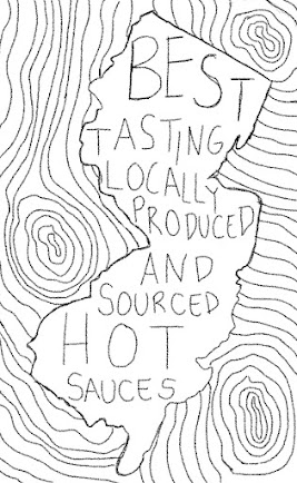
Within my group, I chose to go in the direction of my fourth sketch. I want to push the edgy, darker illustrative style while still keeping the New Jersey, wood texture, and fire elements in the forefront.
I created these sketches in Procreate but I will do the final design in Illustrator. For my final design I want to keep a texture to the graphics and I am going to keep the bright yellow color as it fits into their brand already and is effective in capturing a consumers eye on the shelf. The left side is similar to what is currently on the package, but I'm going to have the ingredients list horizontal and smaller instead of vertical.
I've been focusing a lot on my moodboard on Pinterest to set my visual style and direction. This weekend I'm going to move to Illustrator and begin laying out the elements on the dieline.
______________________________________________________________


Delanie,
ReplyDeleteI love the use of illustration paired with type on your sketch. Have you decided yet what kind of fonts you will be using or will you be going for a more hand-drawn effect? I also really think the color palette you chose evokes hot sauce. Will your bottle have any parts of it that will show the sauce on the inside? I wonder how that would affect/compliment the palette you've picked out?
Also looking at your Pinterest, I can definitely see that textured illustrated look you're looking for.
Great job!