From our scavenger hunt last week, one of the finds was to locate an item that needed to badly be redesigned. While on vacation in Ocean City New Jersey, I found a hot sauce shop on the board walk and found the perfect product.
_________________________________________________________
The first part in our assignment is to create a one-page package case study and create an outline for the die-line. I started by taking photos of the original package and used my personal brand style to formulate a document that shared my ideas of the redesign.
Using my phone charger cord (I do not have any string in my dorm room) I wrapped the cord around the bottle and then measured it with a ruler.
I followed the file set up and color labeling that I learned in my internship with FORCE pkg. I included annotations and a safe area for any copy to stay inside of (that's the dotted line).
__________________________________________________________________
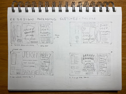
Over the weekend I worked on building a Pinterest moodboard and worked out some sketches. I pinned a bunch of pins and found four directions I wanted to explore. I did close up sketches of the front and then of the full label as well.
I have three main components I want to focus on: New Jersey, flames, and wood texture. I'm keeping the bright yellow color as the primary color with a deep dark charcoal grey for the background.


No comments:
Post a Comment