Wednesday, September 29, 2021

Week Six

My hot sauce rebrand was a success! 

Our class did a new way of critiquing I've never done before. We first picked a random classmates project then broke into small groups and critiqued them. From those small groups we picked the strongest of the three and then shared our thoughts with the class. We then lined everyone's projects up on the steps in the gallery and ranked them from A+, B+, B- and then needs approved. We could only have 4 on each letter level and the rest would have to be in the "needs approved" pile. 

It was a heart-wrenching experience at first with hearing/having to give some brutal honesty, however it was very beneficial. Especially with a packaging project, having immediate and honest comments was important. Our classmates became potential consumers and we had to all compare the effectiveness of our design not to how well we fixed the design from the original, but also how are designs compared to each other. 

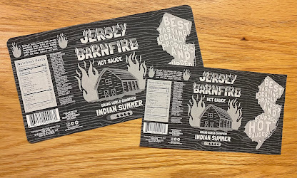
I received a lot of positive comments on mine and thankfully I made it to the top tier. I got a lot of questions on how I got the wood texture to look the way it did (it was gloss ink) and they loved the bold and brightness of it. An improvement they suggested was to increase the size of some of the copy because it is a little too small. 

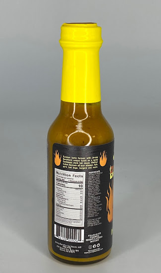
I asked a few of the students in the small group what they thought of the yellow top not matching the yellow in the design. They stated the top plastic yellow would have been too overpowering in the design so they thought my choice of the softer yellow worked. They also thought that maybe a future improvement could be making the top the orange color from the design and not the yellow.

___________________________________________________________________

After finishing our critiques we were briefed on our next assignment. Our task to create a series for a current brand that is composed of different packaging shapes but for similar products. An example Professor Mata shared would be a bottle for liquid bath soap, a pouch for bath salts and a container for lotions. We are also to focus on making these product eco friendly as well.

My mind went running in all different directions. I needed a series of three that could fit a current brand but be unique enough that I break away from the current brands restraints and make it eco friendly. I went right to Pinterest to start. I looked for series of different products and stumbled on a lot of makeup products or beauty for women. I began thinking about women's care and thought of feminine products. The products themselves aren't very eco friendly, but over the past few years tampon and pad alternatives have began to become more popular. 

I continued digging and I decided on creating a three part set of feminine care products: tampons without applicators (no need to create and use wasteful plastic), menstrual underwear that replaces pads (and is washable) and a mensural cup that is completely reusable. For the company brand I want to model, I chose Tampax/Always (I found through research that both are owned by P&G) as I feel I can make this set of products fit into their line up and their logo is more versatile with it just being text.


Through my Google searching I found that Tampax does not have applicator free tampons, Always does have underwear but it is disposable, and Tampax does have a cut product already. However, as I was speaking to Professor Mata about, a lot of period products appear very medical and sterile which important, but with a eco-conscious product like a reusable menstrual cup I would want more green and calming, not glossy, shinny, plastic.


My original thought was to use just different sizes of a traditional box shape, but then I found a website that has resizable dielines I could still use that would add some unique features to the packaging and could encourage reuse of the package. 


My goal for the rest of this week and weekend is to continue researching and deciding on a set direction.

___________________________________________________________________

Sustainability Powerpoint 3 Things I Found Interesting:

1 Sustainability encompasses three domains: financial, social, and environmental. Not only can sustainability benefit the environment, but also, for example, a companies finances with having the opportunity to limit reproduction or material costs when using more sustainable materials.

2. The design strategies or reduce, reuse, and recycle can be broken down into further categories that relate to dematerialization, localization, durability and disassembly (just to name a few). When I think of sustainability in packaging or eco friendly products my first thought is how important the materials can be recycled. However, in this presentation I learned how suitability goes beyond recycling but also addresses making products more durable so they don't have to be regularly replaced or considering their reuse so they can have another purpose beyond just the trash can. 

3. Focusing more on local production and material usage can greatly benefit a products sustainability. Think beyond just the end products environmental conscious and also consider what energy and negativity on the environment was was released in collecting the materials to make your product. 

Monday, September 20, 2021

Week Five

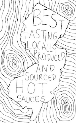
Over the weekend I finished the design for the class critique on Tuesday. I spent a lot of time trying things out and then revisiting them and going back and forth with my decisions. When I first started drawing the flames and the barn, I had used Adobe Fresco but a textured brush. I had drawn everything to the correct size but when I pulled the elements into the Illustrator, everything was blurry. Through some google searching I found out there is a vector brush in Fresco and it worked out great. The barn and flame elements or drawn in Fresco and then dropped into illustrator, and the New Jersey State outline is a Photoshop file that I colored over with a paint bucket. 
 
I also drew the wood texture in Fresco with a vector brush so I could adjust the width of each stroke to look more like wood. The wood texture element was something I originally only had in 1/3 of the design but there was an odd cut on that edge so I decided to just pull it all the way through and really soften it so it isn't distracting. 
 
I'm really happy with how it turned out and while it's such a small label and the shape is pretty easy, I really challenged myself to go in a different direction stylistically and go for something more dark in bold (which I actually really enjoyed). One thing I wish I could add, and I may bring this suggestion up to the class, is adding an overall texture but hopefully I can find the substrate and maybe emulate that with a printing technique.


_______________________________________________________________________

Sadly our class in person was canceled so we did not get to have one last critique before the final project. Thankfully, before I went to print out my final version I did a sample black and white proof to check the size. I had a very stressful moment of me questioning my math skills when I printed out the proof and it was massive...


So I remeasured and decreased the length by 0.25" but still it was huge. So I stopped to think and I realized that my artboard was too small so the computer was blowing the .jpg up to fit an 8.5" x 11" sheet of paper. So I increased the artboard size to 8.5" x 11" and exported as a PDF this time to make sure the white space on the edges wasn't being calculated into the overall size.

I finally got it figured out and at the correct size as a proof. Throughout the whole printing process I made some adjustments to the left side. I increased the weight of the ingredients and made the barcode much bigger. I also increased the font size of their address, social media, and the follow request.


_______________________________________________________________

FORCEpkg (a packaging and design studio I interned at over the summer and still work at on Thursday) was gracious enough to let me print out my project after work. One of the designers helped me prepare my file and walked me through using the uv printer and mimaki cutter to print and cut my label.


I was able to add a special effect gloss to the wood texture in the background that is visible when moved. 


I'm beyond happy with how the final project turned out. One thing I wish I could have done differently was to make the yellow in the design more saturated to match the yellow top better. The softer yellow is a shade of the pure cyan top, but I was worried the bright yellow would be too overpowering, but I think this yellow could have been increased in intensity a little more.


Tuesday, September 14, 2021

Week Four

I uploaded my final paper sketch, the two digitally sketches, and color scheme to D2L to get feedback from my classmates.

My classmates left a lot of positive comments for the colors and style approach and left constructing questions about typography choices and what the final piece will look like.  

Over the weekend I started to work digitally in Illustrator. I have the left panel almost complete with the text, but I just need to add some flames around the paragraph blurb. I started the wood grain for behind the New Jersey state silhouette, but it has a harsh line where it ends. I'm going to try and soften the line with the front flames but I will see how it goes.

For fonts I found Londrina Solid  black 900 weight for the brand name and heading and Lato for the body copy. Londrina Solid still has a handwritten feel with its imperfections and has a thick enough stroke I can draw the flames. 

For the print of the final design, I'm just going to place the new label on top of the old one so you can see the sauce at the top and bellow a little and then a sliver in the back. I'm keeping in mind that this company is a smaller, local brand so their production costs are probably minimal and they most likely couldn't do a knock out somewhere in the middle of the design.


Tuesday in class is our final critique so I hope to have the design finalized and make adjustments on Tuesday from my classmate and professor's feedback.


Thursday, September 9, 2021

Week Three

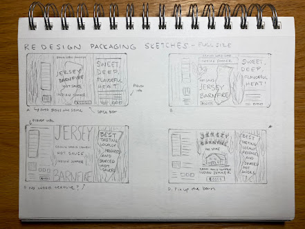
 Within my group, I chose to go in the direction of my fourth sketch. I want to push the edgy, darker illustrative style while still keeping the New Jersey, wood texture, and fire elements in the forefront.


I created these sketches in Procreate but I will do the final design in Illustrator. For my final design I want to keep a texture to the graphics and I am going to keep the bright yellow color as it fits into their brand already and is effective in capturing a consumers eye on the shelf. The left side is similar to what is currently on the package, but I'm going to have the ingredients list horizontal and smaller instead of vertical.


I've been focusing a lot on my moodboard on Pinterest to set my visual style and direction. This weekend I'm going to move to Illustrator and begin laying out the elements on the dieline.

______________________________________________________________


Wednesday, September 1, 2021

Week Two

From our scavenger hunt last week, one of the finds was to locate an item that needed to badly be redesigned. While on vacation in Ocean City New Jersey, I found a hot sauce shop on the board walk and found the perfect product.


The whole line is in need of a redesign, but I chose the yellow one as it caught my eye and is evidently a Grand World Champion

_________________________________________________________


The first part in our assignment is to create a one-page package case study and create an outline for the die-line. I started by taking photos of the original package and used my personal brand style to formulate a document that shared my ideas of the redesign.


Using my phone charger cord (I do not have any string in my dorm room) I wrapped the cord around the bottle and then measured it with a ruler. 

I followed the file set up and color labeling that I learned in my internship with FORCE pkg. I included annotations and a safe area for any copy to stay inside of (that's the dotted line).


__________________________________________________________________

Over the weekend I worked on building a Pinterest moodboard and worked out some sketches. I pinned a bunch of pins and found four directions I wanted to explore. I did close up sketches of the front and then of the full label as well. 

I have three main components I want to focus on: New Jersey, flames, and wood texture. I'm keeping the bright yellow color as the primary color with a deep dark charcoal grey for the background. 


FINAL WEEK

Painting the sheets became a bit of a struggle I wasn't expecting. I started by painting one sheet, doing my best to get the yellow colo...